
I’m fascinated by Yuichi Yokoyama, and have been since I got my hands on his work when it was originally published by PictureBox back before that venture closed up shop. Yokoyama’s skill is undeniable, his comics strange and dark. And, fittingly, Yokoyama’s been a recent artist of note and discussion; his 2016 comic ICELAND has been recently published by Retrofit as part of their Spring 2017 comics line and another of his books, Outdoors, is to be published by Breakdown Press later this year. Also, Ryan Holmberg, the translator for ICELAND, has recently published one of a planned two articles at length about Yokoyama’s audiovisual abstraction at The Comics Journal. Today I’m reviewing Yokoyama’s ICELAND, which is a sequel of sorts to World Map Room, a longer work that was published in 2013 by PictureBox.
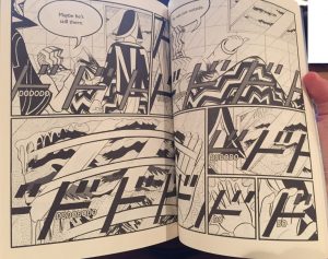
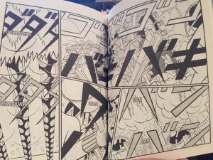
ICELAND is a 92-page softcover graphic novel, featuring a cast of humanoid characters with oddly shaped heads. They journey into a frozen arctic land to find a man in a picture, and in doing so, encounter a shark fisher, an extremely loud bar, and a high-speed taxi driver. Yuichi Yokoyama’s pacing is incredibly slow. Very little happens in terms of plot. Each scene is mired in a sense of paranoia; each character moves and acts as minimally as possible, as if to hide their intentions from a surveilling evil. But perhaps, more notably, Yokoyama has a unique visual style that emphasizes the use of sound effects as elements of the comic. Yokoyama’s lettering for these sound effects is extreme, and they chop through panel after panel as an extremely visual element that emphasizes that sound in a way that can only be described as loud. The lettering is as much a part of the action of the book as the actual character movement, perhaps moreso. Yokoyama’s art is bold, full of straight lines and repeating patterns; the overall effect is cacophony.
The translation into English is done by Ryan Holmberg, previously noted manga scholar, who has also worked with UK-based Breakdown Press. I have a high amount of respect for Holmberg’s taste and work, and so any project with his name attached to it is likely to earn my comics dollars. I bought into Retrofit’s Kickstarter this year expressly for the exact purpose of getting ICELAND. It’s hard for me to not recommend a new Yuichi Yokoyama book to readers who might be passively interested in his work. And, to be fair, I really liked ICELAND. That said, this printing of ICELAND does have its issues, primarily in the way the book was adapted and designed.
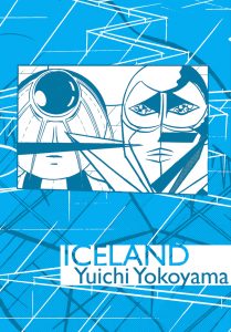
Having been printed in 3 different languages, ICELAND as a comic now has three separate covers and book designs. The Retrofit design is clearly the worst of the three. The primary color of the cover is a garish blue with additional lighter blue and white throughout, and the design features two of the characters’ heads. The inside cover is especially confusing, with gradient blue moving from dark to light and converging on the middle where Yokoyama’s linework is printed in blue. I’m also not in love with the cover stock, which feels thin and cheap. I think this is my baggage – I’m probably spoiled by PictureBox’s more luxurious releases. But a slightly heavier stock or a matte finish would have gone a long way in making this book feel more like the Yuichi Yokoyama books I’ve come to know and recognize. Retrofit, at least with this release, stands in a long shadow.
Another flaw is the choice to adapt the sound effects so that their translations are printed above, around, or below them in big block lettering that is often white with a black border. Other translated editions make the translated lettering as unobtrusive as possible, where this lettering draws the eye away from Yuichi Yokoyama’s text. This is a tragedy, because the eye is pulled away from one of the most aesthetically pleasing pieces of Yokoyama’s work. This adaptation blunts Yokoyama’s strengths, and serves to make him quiet when he deserves to be loud.
I don’t generally call out design or lettering like this, but I think for Yuichi Yokoyama, where the aesthetics of the book are so tied up with its design and lettering, these flaws do significant damage to the overall power of the book. Which is a shame; ICELAND was one of my most anticipated releases from Retrofit this year, and it feels like a letdown.

You can see more of my reviews of Retrofit books here. If you like the writing I’m doing, please support Sequential State on Patreon. Thanks!