This is it: the last edition of the Comics That Challenged Me in 2016 list. The full list (a compilation of the comics discussed in each of these 5 breakdown posts) will go up tomorrow. I’ve heard from some of you on twitter and I’d love to keep talking about these comics.
Part 1 | Part 2 | Part 3 | Part 4 | Part 5 | Part 6 | Complete List
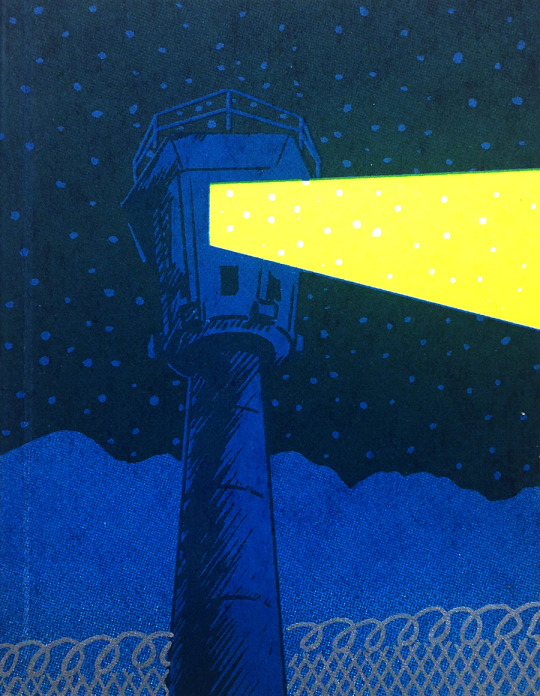
Cleansweep Series- CF, self-published
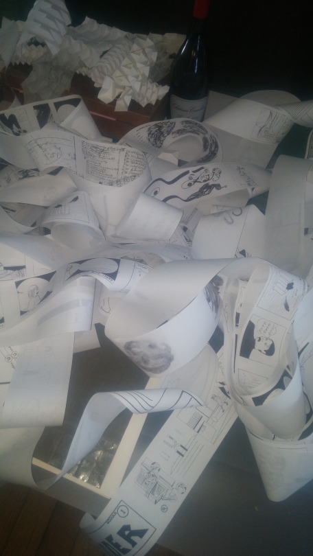
Cartoonist Christopher Forgues (who publishes comics under the name CF) released a set of three comics printed in an unusual format – as rolled up thermal printed receipts. Each of the three comics, Call Magazine, Ladder, and Bonjour! were about 8 meters long and contained anything from handwriting samples and crayon rubbings to new comics and translated reprints of previously published work. The format was perplexing; without a strong plan for rerolling the rolls, the act of reading these comics would generally make them unstorable and unwieldy, essentially destroying them. This, in a small sense, transgresses against the standard ideas of comics collection, which even in small press circles can lead to expensive, rare, sought-after zines. Whether or not these comics get reprinted in a different
format is not a guess I’m willing to make, but this experiment in production
and form was one of the most perplexing reading experiences I had in 2016.
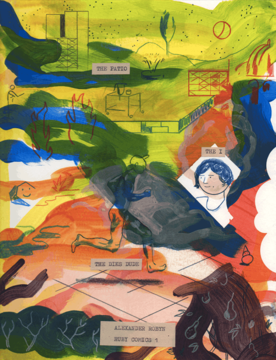
The Patio – Alexander Robyn, Vice/self-published
I was initially drawn to Vice’s curated comics selection by Megg, Mogg, and Owl, but there has been some interesting work published there this year, not least of which was Alexander Robyn’s The Patio, a perplexing encounter between a character and two assailants during a team dinner party. Each of the pages uses what feels to be a freeform painted background, with an array of blues, greens, and oranges, while figures are drawn on top with colored pencil and text is overlaid in a typewriter paper format. The way Robyn uses the paint to generate background objects and also introduce
chaos into the comic is fascinating. The text is also interesting, misspellings
and editors marks throughout, making it seem as though it was printed on
another sheet, edited, and then cut and pasted to the page. All of these
extremely physical effects in a webcomic made Robyn’s one of the most
interesting formal experiments in webcomics in 2016.
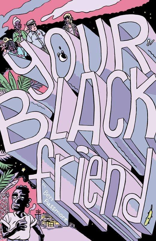
Your Black Friend – Ben Passmore,
self-published/Silver Sprocket Bicycle Club
Ben Passmore’s Your Black Friend is billed as an “open letter from your black friend,” and addresses very directly the racism that black folks have to deal with, from the self-monitoring to the anxiety about being in crowds or being singled out as “that black guy” as opposed to being “your black friend.” As a white person, I will never truly and fully understand the amount of racism and discrimination that people of color face. Passmore put that reality on the page in an engaging way, causing me to self-examine and sometimes cringe with self-awareness. Your Black Friend is a necessary read in these trying times.
Christmas in Prison – Conor Stechschulte,
self-published @crepusculararchives
Stechschulte has graced this list before, and both Generous Bosom and The Amateurs are both fascinating comics, but of Stechschulte’s latest comics projects, Christmas in Prison takes the cake. Using screen printing, risograph, and offset printing, in a handbound book, Stechschulte is working with some of the same ideas as the Weakly XL Annual (which is another book on this year’s list). It feels like Stechschulte is experimenting with both the concept of “comic book” as a physical object and abstracting some of the ideas he has been exploring in Generous Bosom, especially in terms of observation. Stechschulte also interrogates the idea of the book itself, and at one point printed fingers turn pages. Christmas in Prison is formally daring and a real headscratcher. It feels like you could start at any point and read the thing in a cycle.
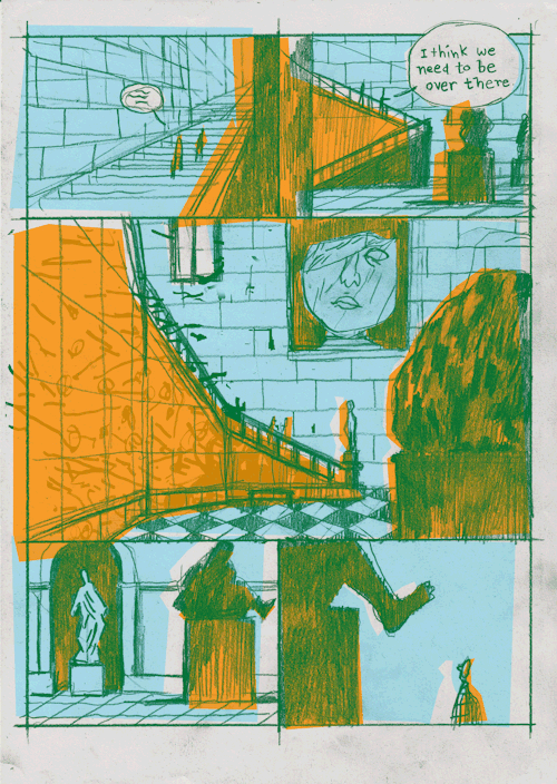
Sacred Conversation – Jack Brougham, Comics Workbook @comicsworkbook @jackbroomlandfill
Brougham’s Sacred Conversation feels essentially Santorian, with its blocked contrasting colors and vividness, but I think this piece is probably one of the best I’ve seen to integrate Frank Santoro’s teaching on comics. Ultimately though, it was Brougham’s discussion of aging and depression, the sense of a midlife crisis or one soon impending, that had me fascinated. Brougham’s characters move through an impressive natural history/art museum collection, and we see Brougham disrupt classic paneling by setting word bubbles on top of the panel lines, implying that the conversation picks up during transition from piece to piece. How we confront our anxiety and mental health is a deep vein worth mining in comics, and to see Brougham’s characters identify the problem but essentially ignore it feels a little too close to the skin.
That’s a wrap folks! The full uninterrupted text list goes up tomorrow.
Sequential State is run ad-free, and instead relies on readers like you to help advance its core mission. If your reading experience today was worth a dollar to you, please donate to the Sequential State Patreon. Thanks!